8 Common Web Template Mistakes To Avoid in 2023 [UPDATED]
A web template is a great way to build a website quickly and easily at an affordable price. However you should keep in mind that 94% of first impressions of websites are based on design aesthetics.
If you are looking to build a website using web templates this 2023, you should be aware of these mistakes to avoid.
Web Template Mistakes to Avoid in 2023
1. Complex and Complicated Layouts

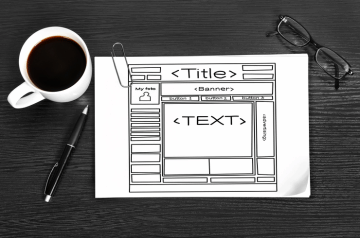
While it's important to create a visually appealing website, it's also important to ensure that it has a simple and clear layout. Pre-designed web templates usually come with fixed and less flexible layouts.
Avoid using complex layouts and steps - as it can make it difficult for a user to navigate through your website. Users may find it frustrating or time consuming to find the product or information they need. Too many steps or design elements on a page can be overwhelming - causing visitors to exit with a bad user experience.
2. Slow Loading Website

With the increased use of mobile devices and the expectation of instant gratification, it's crucial that you ensure your website loads quickly.
Web templates that include large file sizes, poor hosting, too many plugins, poorly written code and browser caching are some of the contributors to a slow-loading website.
A slow-loading website template can negatively impact user experience, resulting in higher bounce rates and lower engagement rates.
3. Inconsistent Branding

Your website should reflect your brand's identity and values. Keeping this in mind, a website design that doesn't communicate your brand’s Ideology can cause confusion and make people less likely to trust your brand.
Inconsistency can result in steering your website audience away from your site and over to a competitor. A successful user-interface design is where there is consistency amongst all the design elements and all the sections are in sync, complimenting each other well. Therefore, consistency plays a key role in building your user-interface design.
Ensure that you choose a web template that is consistent with your branding. This will simplify your customisation process across all of the pages of your website.
4. Non Responsive Mobile Optimisation

People are increasingly using mobile devices to access the internet on the go, so it is now crucial that your website is optimised for mobile.
To avoid these issues, opt for a responsive design and test your website on various devices to make sure it adapts and scales on different screen sizes and orientations, and make use of mobile-specific action features such as click-to-call buttons or mobile-friendly forms.
5. Poor Navigation

Your website's navigation should be intuitive and easy to use.
A bad customer experience can be caused by a website that has a hard-to-use template. To avoid this, build your website around your customer’s preferences and wants by using their feedback. Make sure that people who come to your site know who you are and what you do. Avoid having cluttered navigation with too many options.
Format a design that makes it easier for users to find what they're looking for. People go to websites for a reason, and they need to be able to see what they want as quickly as possible.
If you’re redesigning your website - revisit heat maps of your page traffic and user journeys to identify pages which may have high traffic or high bounce rates. This can help you to identify opportunities for design improvements.
6. Unreadable Typography

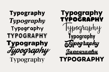
Typography plays a key role in website design, as it affects both the visual appeal and readability of the website. It is important to choose a web template with fonts that are readable and reflect the brand's identity. Font sizes should be large enough to read easily on varied devices, while a larger font size should be used for headings and subheadings.
These considerations might seem like the nitty gritty parts of web design - but they are vital in improving the accessibility and visual aesthetics of your website. Not only will careful selections add credibility - but they will result in a better user experience for visitors.
7. Stock Photo Overload

While stock photos can be a great source to add visuals to your website, overusing them can make your website look generic or unoriginal.
Web templates use a lot of placeholder stock photos as they are just templates. You should consider using photography of your business and team or custom illustrations to give your website a more personalised and unique look.
8. Lack of Accessibility
Accessibility is essential for a website design as it ensures that all your visitors, including those with disabilities, can access and use the website. It also promotes inclusivity, legal compliance, improved usability, better SEO, and a positive brand image. By choosing a good web template, you can improve usability, SEO, and your brand image.
To sum it up..
If you keep these points in mind, you should be able to avoid the common mistakes made during the web template selection process and make the right decision when choosing a web template for your new website.
If you’re looking for a professional website design tailored to your business needs - talk to the experts at Elephant in the Boardroom today.


