TOP 5 Genius CTA Options That Everyone Clicks
Thinking about CTA (call-to-action) options will put you to sleep faster than counting sheep.
Shop Now. Sign Up. Subscribe. Learn More.
You're looking for more options because you're sick of the same old ones—we feel the same way! You need more clicks, and that dull stuff isn't going to cut it.
Here is your marketing wake-up call. We've compiled a list of the most unique, creative, and successful call-to-action examples from all areas of marketing, from Google Ads to landing pages, inspire yourself with these example and step up your game.
By the end of this article, you'll have at least 5 new call-to-action ideas for your own ads or landing pages that will get you more attention and clicks than ever before.

Create Brand Reputation with Perfect CTA Options!
Let's Talk/Get a Quote1. ETSY
CTA: Make them smile
‘Make them smile’ could be the sweetest call to action you've ever heard. Add an emotional pull to your copywriting when customising and tailoring your CTA button. This one is aimed at anyone who wants to make someone’s day.
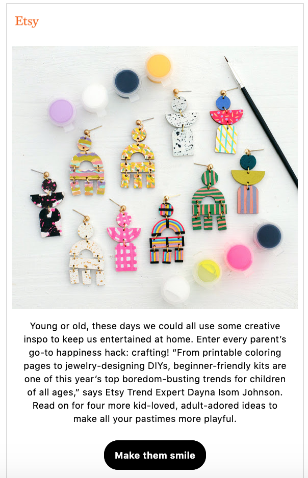
Image source: https://www.etsy.com/
2. ELEPHANT IN THE BOARDROOM
CTA: Get a free quote
Fewer options limit choice. 50% of that choice is to say yes to your CTA.
With a simple "Get a free quote" button, this Elephant in the Boardroom CTA generates leads. Within seconds of landing on the page, a potential customer will know what to do next thanks to the CTA button above the fold.
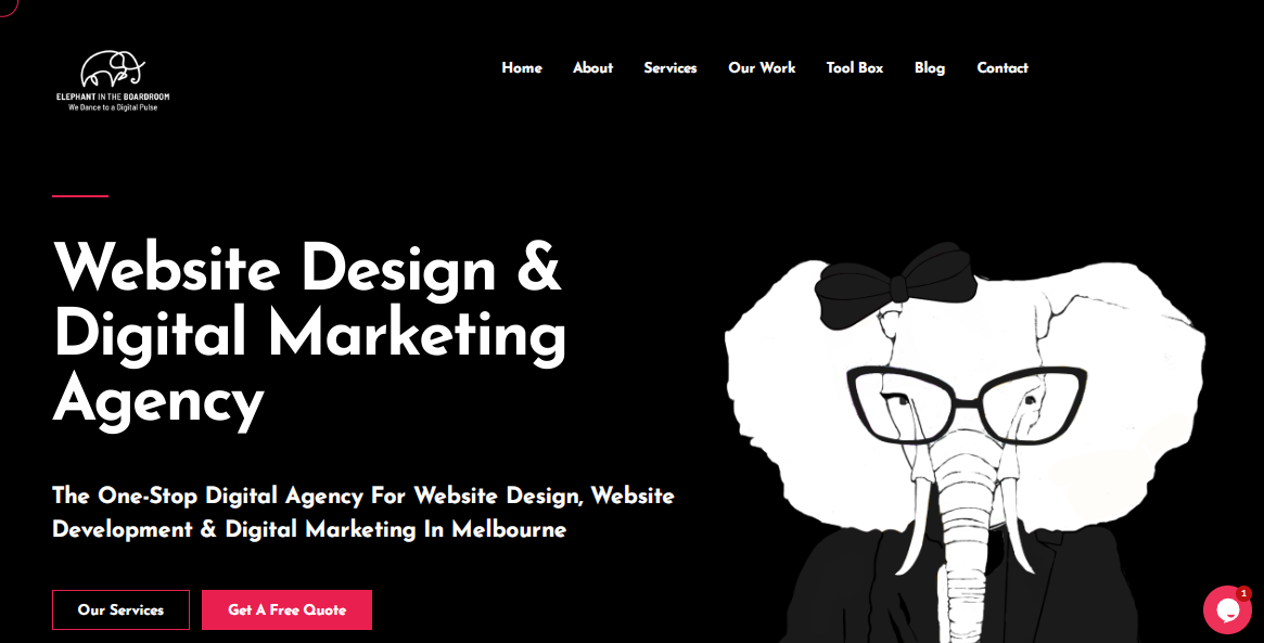
Image Source: https://www.elephantintheboardroom.com.au/
3. TEAMZY
CTA: Start free trial
Advertisers aren't limited to just one CTA button, as Teamzy's landing page demonstrates. In fact, you can have multiple CTA buttons. It just must be the same one for everyone. Users have more clickable options to start a free trial with the two pink "Start Free Trial" and "Start Trial" buttons.
More click opportunities, not more options.

Image Source: https://teamzy.com/
4. HUBSPOT
CTA: Download now.
This slide-in CTA from a marketing intelligence article shows how a well-placed call-to-action can improve the user experience.
It's unobtrusive and appears in the middle of the article, encouraging readers to "download now" while also providing a useful and free resource. After reading the article, readers can download the guide with templates to get started creating their own marketing kit.
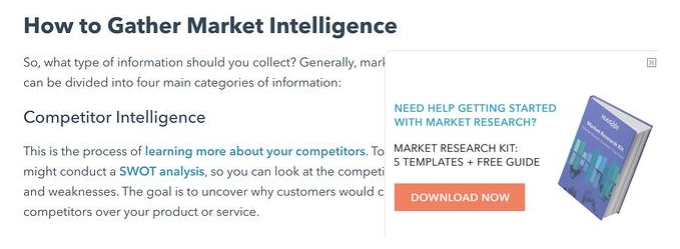
Image Source: https://www.hubspot.com/
5. THE BUDGETNISTA
CTA: Sign Up For Weekly Goodies
Who doesn't want weekly goodies? "Sign Up For Weekly Goodies" sounds a lot more appealing than "Sign Up For My Newsletter."
With the friendly and creative use of language, visitors are invited to take the desired action. This even reflects the personality of the owner, which is a nice touch that helps to personalise the interaction.

Image Source: https://thebudgetnista.com/
Key Takeaways to create clickable CTAs
Set Your Goal: Your goal is to get as many clicks as possible. But how many clicks are there? This is dependent on your previous performance, your consistent effort, and your reasonable projections. Set a reasonable goal for yourself, but don't slack off.
Utilise action words and verbs: You have a literal ton of action words to choose from. So go for originality. Have fun with it!
Make sure that your CTA is visible: It's a failure if someone has to scroll down to find your action button. The call-to-action cannot be placed below the fold (below what the user sees on their screen). That call-to-action is placed directly in front of their eyes.
Make your CTA into a button: There's no rule stating that you can't bury your action desire in a simple HTML link. But why not make your CTAs look like buttons to take advantage of the size, contrast, and immediate recognition that buttons provide? Friends, make your CTA buttons. Unless you're doing raw coding, every CMS and theme has a drag-and-drop feature.
Always A/B test your CTA’s for continued success!
That is all there is to it. You can see how critical a few minor call-to-action changes can be. Create CTAs that convert using the examples above as inspiration.
Need help with your marketing needs? Team Elephant can help you with that!


